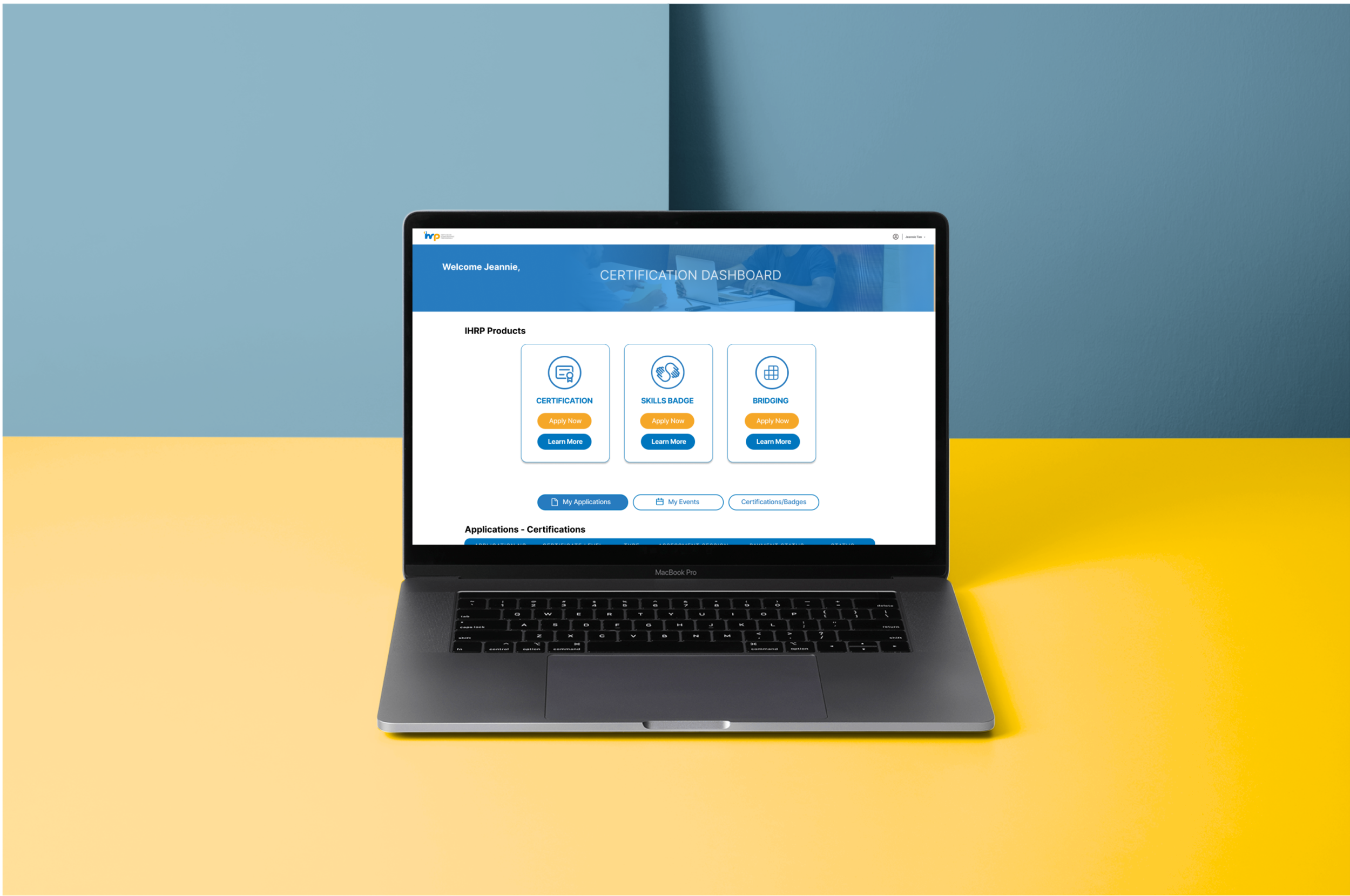
INSTITUTE OF HUMAN RESOURCE PROFESSIONALS (IHRP) - ONBOARDING portal for new members
Background
Client - The Institute for Human Resource Professionals ( IHRP ) This is a General Assembly Project with a live client
Services - Implements national human capital programmes, such as IHRP Certification & Skills Framework for HR
Reach - Professional HR practitioners in Singapore
Partners - Consist of a tripartite: the (Singapore) Ministry of Manpower, the National Trades Union Congress (NTUC) and Singapore National Employers Federation
The challenge
design Process
Followed the Design Thinking process throughout the 3 week long project
We kicked off this project with a stakeholder interview. At this meeting, we met the team from IHRP and we learnt that the visitors to the site were facing difficulties with the on-boarding process. Knowing that the onboarding stage is the crucial first impression and that this will color the user’s future interaction with IHRP, we used this as a jumping off point to dig deeper to uncover a better understanding of the issue from a user’s perspective. We followed the EDIPT process to investigate how human resource professionals may want to re-imagine a better experience with the platform.
EXPLORE phase
usability testing
In the first round of testing, we recruited 6 users to test out the current IHRP onboarding portal. We prepared a set of task for the users to attempt. At the end of each task, the users ranked the difficulty of each task from 1 (easy) to 7 (difficult). The scores were then averaged out.
user interviews & early insights
We Interviewed HR professionals to collect qualitative information about their experiences to learn about their challenges in order to identify possible needs or wants that could be met with suitable features. Information collected through user interviews were then sorted with affinity diagramming sessions. Some early insights we found were:
No process references - The first time a user attempts to sign into the portal, they are met with empty dashboards and forms with no indication of how to proceed.
Unclear sign up value - Setting up a profile takes substantial time and effort but the user do not clearly understand the value this requirement
Overwhelming sign up process -The average user is required to complete multiple identical looking forms with confusing instructions. If the user made filled a form incorrectly, they will not be allowed to proceed. The mistake will not be indicated to the user.
User research findings
Relevant Information points from the affinity mapping clusters were selected and re-written into user “ i “ statements. These statements represent the user’s voice distilled from the collected data.
define phase
Persona Definition
Information gathered from user interviews were sorted through empathy maps to create user personas. This helps us gauge user need and pain points felt by HR professionals by expressing their behaviors, frustrations and goals.
problem definition
We created a list of ‘How Might We….’ questions to help us better align to our user’s objectives and goals.
We used these ‘HMY’ statements to frame our findings into opportunities in order to guide design studio ideation sessions at the next stage.
IDEATE phase
design recommendations
We conducted a design studio session to generate solutions framed by the ‘How Might We…’ questions.
Prototype & Testing phase
onboarding Portal - identification of painpoints
This sitemap of the current onboarding portal informed the design of the new user’s journey. We carried out a session where we captured the specific pain points from the user’s journey during the user testing sessions so that we would be able to pinpoint exactly where improvements and new features would be implemented in the prototype. It is very important to be very specific and precise in the identifying of the items for improvement in this exercise.
Current Onboarding Portal with pinpoints indicated during user testing
New Prototype
onboarding Portal - prototype and key solutions
compromises & Learnings
Our main challenge in this project was the lack of time especially when it came to recruiting HR professionals for our research. Originally, we had planned to strictly recruit HR professional from multinational companies who are the main target users of the IHRP site. However only a few responded due to the short lead time, we had to expand our recruitment requirement to include business owners who were also responsible for their company’s HR activities, HR professionals in institutions and other HR practitioners.
Ideally, it would be best to run our research with our original recruiting requirements however, we realized that the issue with the onboarding process was mainly a user interaction issue and less to do with HR specific issues. With this challenge, we had to be resourceful with our recruiting in order to keep within the available time and technical constraints, while still providing valuable and meaningful input for the clients. Ultimately, the recruited users were able to provide us with many meaningful insights on improving the onboarding process and the outcomes was well received by the client.
Some key learnings from this project are:
Focus on solving the problem. In the midst of the many activities within the project, its easy to lose sight of the main objective- to solve your user’s problem and to ease their pain points. It’s important to identify key features that will deliver the best value to your users and to not be distracted.
Don’t forget that you’re the user’s champion. While we will always keep the stakeholder’s ( client ) requirements and constraints in mind, the user’s challenges and best interest must be kept closest to heart.
It’s not about the tools. As UX designers, we have many tools at our disposal, but they are not sacred, we can pick and choose the most appropriate tool that will get us to the meaningful insights we need.
NEXT steps
Watch this space! I’m currently working on an updated design with a new style guide in order to further refine the onboarding experience and incorporate more of my own design sensibilities.


